Revisiting 2018: The Top 10 Fonts that Shaped the Design Landscape
As we traverse through the chapters of time, each year unfurls unique trends and styles that leave a lasting impact on the design world. The year 2018 was no exception. It was a vibrant period that saw an eclectic mix of fonts rise to prominence, each contributing to the visual language of the year in its own distinctive way. This article takes you on a journey back to 2018, revealing the top ten fonts that emerged as game-changers in the realm of graphic design. The selection is based solely on the sales data from YouWorkForThem.
1. Integral CF
Designed by Connary Fagen, Integral CF took the silver in last year’s Top Ten roundup, moving up to take the number one spot in this year’s list. Integral CF is an intense, all-caps sans serif with a serious “go big or go home” attitude. With Integral CF’s design, Connary wanted to go bold, to design a typeface that was expressive and strong but still legible and adaptable. Integral CF is a particularly excellent choice for signage and displays, titling, posters, book covers, logos, apparel, product packaging, merchandise, and any design project that needs to make a strong visual statement.
2. Greycliff CF
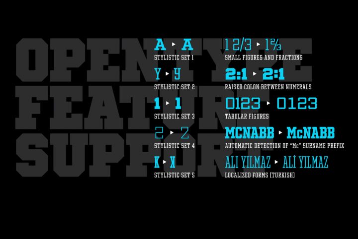
Greycliff CF, also designed by Connary Fagen, takes this year’s silver. Greycliff CF is a geometric sans serif that will never go out of style. Featuring an architecture that’s kind of the little black dress of sans serifs, Greycliff CF is adaptable to just about any type of design project. Featuring seven weights with corresponding obliques for each, extensive multilingual support and plenty of additional OpenType features, this type design is perfect for everything from displays and signage to headlines, editorials, body copy, website design, publishing, advertising, logos, presentations, white papers, mobile applications, identity, and branding projects.
3. Oakes Grotesk
This year’s bronze goes to Oakes Grotesk, a contemporary sans serif type design by Samuel Oakes. Oakes Grotesk carries a modern architecture with a distinctive corporate vibe. Oakes Grotesque was designed to offer high legibility and a neutral tone, making it a perfect choice for all things corporate, including logos, letterhead, presentations, white papers, and company websites. It also works well in publishing, headlines, editorials, body copy, product packaging and inserts, labels, and advertising.
4. Vanguard CF
Taking the fourth spot in our Top Ten Fonts of 2018, Connary Fagen makes the list again with Vanguard CF. Connary mentioned that Vanguard CF is “a kind of sibling typeface” to Integral CF, only this time he explored height over width. Vanguard CF is the leaner and taller of the two, a runway model that gives designers a stylish option for projects where horizontal space is limited. This type design is highly versatile, offering eight weights with corresponding obliques for each. It’s well suited to everything from headlines and editorials to displays, signage, advertising, posters, product packaging, logos, publishing, and more.
5. Bison
Designed by Ellen Luff, Bison is an all-caps family of sans serif fonts that was inspired by the powerful muscle and sturdiness of the animal itself. Bison brings perfect balance to its smooth curves and hard edges, featuring an architecture built from softness and strength. Designed to be dynamic and authoritative, Bison offers four weights that range from Light to Bold, with two Outlines (Thick and Thin) and corresponding italics for each. This type design is a sophisticated option for logos and branding, titling, advertising, headlines, product packaging, book covers, and any design project that needs a contemporary and versatile all-caps sans. Bison extends multilingual support to all Central and Western European Languages, African languages, and Vietnamese.
6. Avallon
Coming in sixth place in our Top Ten Fonts of 2018, Set Sail Studios made the list with Avallon OpenSVG Font, a brush script type design. Making use of the new OpenSVG font format, Avallon brings a brush texture so realistic, you’ll want to reach out and run your fingers over the screen. This type design was Sam Parrett’s first foray into working with OpenSVG and it uses actual brush strokes for incredible definition. It works like any other font and can be used on any type of background, but you get a photorealistic paintbrush effect and a transparent texture – with no additional work on your part! Avallon OpenSVG Font is ideal for projects of all kinds, including logos, advertising, product packaging, merchandise, apparel, displays, signage, identity, and branding.
7. Neufile Grotesk
Designed by Letter Omega, Neufile Grotesk is a well balanced neo-grotesk sans serif type design that is ideally and equally suited for display and text use. Neufile Grotesk’s architecture provides stellar legibility, even in small point, and its neutral tone makes it adaptable to just about any kind of design project, including displays, signage, headlines, editorials, publishing, product packaging, logos, letterhead, corporate communications, presentations, infographics, branding, identity, website designs, and mobile apps.
8. Cinderblock
Designed by Stefan Kjartansson, Cinderblock stands as “The World’s Tallest Typeface.” Like its name suggests, Cinderblock was inspired by masonry and features razor-thin white spaces between the characters, enabling designers to stack letters, sentences, and paragraphs to create a visual effect like that of a cinderblock wall. Each of Cinderblock’s eight heights grows approximately 25% taller than the one previous, achieving maximum vertical coverage and taking this all-caps sans serif to uncharted heights. This type design is best suited for bold displays, signage, titling, posters, book covers, logos, headlines, and any design project that needs a seriously bold sans serif to take center stage.
9. Madina Script
Making our Top Ten Fonts of 2018 for a second time, Set Sail Studios takes ninth place with Madina Script, a fun yet elegant cursive script font that’s rich in personality. This bouncy, bubbly type design is written in a feminine hand with a carefree spirit and plenty of joie de vivre. Madina Script is sophisticated and playful, a beautiful choice for any design project that needs sweetness and sass, including wedding invitations, greeting cards, logos, social media imagery, product packaging, advertising, merchandise, and apparel.
10. Gilmer
Designed by Piotr Lapa, Gilmer is a fresh and contemporary sans serif type design that was inspired by iconic, classic typefaces like Avant Garde and Futura. Gilmer’s architecture achieves a similar timelessness, featuring sharp edges, smooth curves, and a high x-height. Available in five weights that range from Light to Heavy and one Outline display variant, Gilmer is incredibly versatile and well suited to everything from displays and signage to headlines, editorials, publishing, logos, advertising, product packaging, corporate communications, letterhead, branding, and identity projects.
11. Grold – Honorable Mention
This year, an honorable mention goes out to Grold. Released by Typesketchbook, Grold very nearly made it into the Top Ten Fonts of 2018 and that’s really saying something considering that it was just released in November. This post-geometric type design offers 40 fonts in total, with ten weights ranging from Thin to ExtraBlack and corresponding italics for each in both normal and Slim widths. Designed to be highly versatile, Grold works beautifully in headlines, subheadings, editorials, advertising, logos, product packaging, corporate communications, presentations, publishing, website designs, mobile applications, identity, and branding projects.
We sincerely hope that 2019 brings nothing but wonderful things your way. May this year be kind to you, and may all of your design projects kick ass!
