We’re always excited whenever new foundries and designers join the YouWorkForThem family, and we’re thrilled to introduce Spacetype Ltd., the independent type foundry established by Stan Partalev and Mirela Belova.
The duo has been working together successfully for the past few years, an endeavor that inspired them to venture out together to create their own type foundry. Stan and Mirela are both accomplished designers and typographers; together, they are a creative force to be reckoned with.
Born and raised in Sofia, Bulgaria, Stan told us that he has “always been fascinated by the visual arts and have been painting since I can remember.” He studied many fine arts in high school, later attending the Bulgarian National Academy of Arts to study Poster and Visual Communication. Following his graduation from the academy, he began working at the type foundry where he met Mirela.
Mirela’s career in type design began four years ago following a workshop on designing type. Previously, she studied graphic design at New Bulgarian University. She was “particularly interested in the more nerdy part of the design process,” she explained. “And to be honest, I never really thought about becoming a type designer before then.”
After the workshop, Mirela was invited to work as a type designer at Fontfabric. “There, I grew to love all things type,” she said, adding that most importantly, she got to know Stan.
Stan told us that he had been interested in type design ever since he was a college student. “Fonts and typography are an essential part of poster and graphic design,” he said. “My teachers have always insisted on well-constructed and legible letters, and adequate spacing and kerning. Of course, this was challenging for me in the beginning, which pushed me to study the font creation further.”


Mirela is drawn toward the problem-solving aspect of type design. “What I love about type design is that you can get quite creative, but at the same time there are a lot of issues you have to think about before you can call a typeface ready for release,” she explained. “There are plenty of cases you have to solve design-wise, so every letter goes seamlessly with one another, and also tons of technical stuff you have to take care of. And I absolutely love solving them!”
The pair brings a perfect balance to one another. Stan’s favorite part of the design process is the initial phase of creating a typeface. “I adore prototyping different letters and building a glyphs case for the various language groups,” he told us.
Mirela, on the other hand, prefers the finishing part of the process. “Testing and fixing issues is my greatest strength,” she explained. “Stan and I work together quite smoothly.”
Together, Mirela and Stan launched an endeavor that’s driven by their shared vision and inspiration with a focus on producing high-quality original fonts.
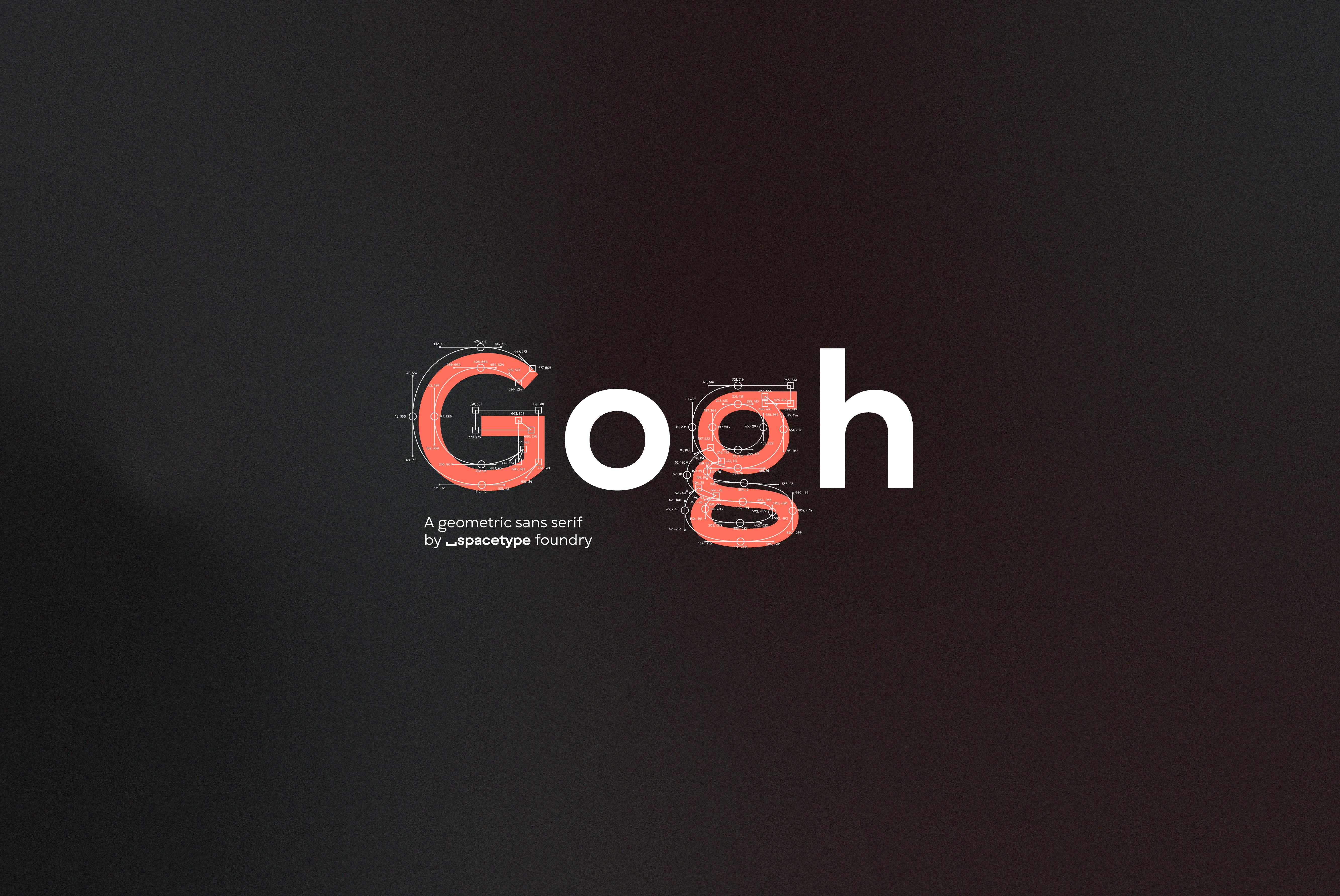
We’re excited to share Spacetype Ltd.’s very first release through YouWorkForThem — Gogh, a geometric sans serif with a modern aesthetic and traditional spirit.
Stan told us that the pair was inspired by many examples of similar typefaces from around the world. “We strongly believe that type designers have to develop fonts they would personally love to use,” he explained. “As for our first independent typeface, we wanted to design a sans serif that is aesthetically pleasing and easy to read.”
Gogh is Stan and Mirela’s interpretation of fonts like Gotham, Gilroy, Nexa, and Avenir, among many others. Featuring a generous x-height, open terminals, and easily distinguishable glyph forms, Gogh has a rich and distinctive visual character that lends itself to an incredibly comfortable reading experience.
“The medium weights are ideal for long text, while the thinner and thicker ones are great for headlines, posters, and all sorts of display layouts,” Stan said.
Gogh is available in Hairline, Thin, Light, Book, Regular, Medium, Bold, Extra Bold, Heavy, and Black, with corresponding italics for each. It also includes a “fully functional variable font that is perfect for the web as it has a much-compressed size and gives room for creativity since it removes the restrictions of the predefined font weights,” Mirela explained.
Mirela added that Gogh offers a wide range of OpenType features that includes a stylistic set that changes the feel of the font entirely, making it appear more contemporary, along with a variety of symbols, numbers, and other glyphs for exceptional versatility.
Stan told us that he normally keeps a pencil and sketchbook close at hand no matter what he’s working on so that he can make quick or detailed sketches whenever needed, but this type family was largely crafted digitally.


“Particularly for Gogh, we had a pretty clear idea from the beginning what we wanted as a final result,” he explained. “So the prototyping was for the main part straight on the computer. We only used quick sketching for some letters here and there.”
Mirela told us that they primarily use Glyphs for building their fonts, but will naturally switch to various testing and post-production programs and websites to ensure that everything is working as it should in application.
That said, the design process did present its own set of challenges along the way.
“Perhaps our most significant hurdle when designing Gogh, was that we wanted to add so much more stuff to the font – more glyphs, languages, alternatives, features, and all sorts of other things,” Stan told us.
He added that the hardest part is knowing when to say that something is “complete,” recognizing when enough is enough and it’s time to move on to the next project.
“Every project has its own issues that no one expects to encounter at the beginning. Same goes for Gogh, as well,” Mirela explained. “But with each project, we try to upgrade our knowledge and our workflow. We did experience some challenges with the variable fonts, as it is a pretty new technology, but we are proud to say that we tempered them all.”


The full range of weights makes the Gogh family perfect for everything from displays and signage to headlines, editorials, advertising, logo designs, product packaging and informational inserts, promotional materials, website designs, mobile applications, and so much more. It is an excellent choice for branding and identity projects that require fluid design cohesion across multiple media types.
Gogh is loaded with OpenType features that include case sensitive forms, standard ligatures, discretionary ligatures, fractions, ordinals, subscript, superscript, scientific inferiors, slashed zero, tabular figures, contextual alternates, and stylistic alternates for incredible versatility. It extends multilingual support to Basic Latin, Western European, Euro, Catalan, Baltic, Turkish, Central European, Romanian, Pan African Latin, Dutch, Afrikaans, and Basic Cyrillic, offering plenty of flexibility for graphic design projects intended for an international audience.
Right now through October 17, 2020, Gogh is on sale for 70% off of its regular price so it’s the perfect time to add this family to your font collection!
While Spacetype Ltd. currently has just one product available through YouWorkForThem, you can visit their portfolio and bookmark it so you won’t miss out on any of their future releases.
Stan told us that they are full of projects they want to finish shortly. “We are currently working on several more type families – one other geometric sans and a serif, which we plan to release next year,” he explained. “In the meantime, we are developing two free fun display fonts, which I hope will soon delight our fellow designers.”
Mirela told us that she is excited about the launch of their website, on which Vlad and Alex from Gradientic are working. “They helped us design some of the sections of the presentation. And for now, the site will be dedicated solely on Gogh and will be full of pretty cool interactions, so stay tuned!”


