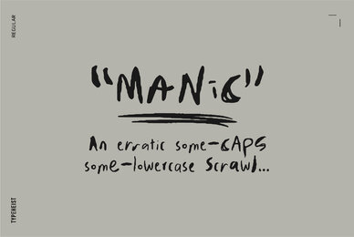
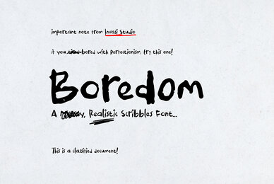
Incorporating "ugly" fonts into design projects is a bold move that can yield surprisingly effective results. These unconventional choices can breathe life into a project, making it stand out in a sea of polished, predictable designs. Here's how:
The Allure of the Atypical
Ugly font—a term that immediately piques interest. What indeed makes a font "ugly"? Is it the unconventional shapes, the discordant lines, or the challenge they present to legibility? Within this collection, we journey through ugly cursive fonts and ugly handwriting fonts, demonstrating how these rebellious designs can invigorate a project with their distinctive character.
A List of Unconventional Achievements
Embracing the so-called "ugly" fonts can lead to unexpected and strikingly original design outcomes. Here's what they can achieve:
- Uniqueness: Stand out from the crowd with fonts that shun the standard looks for something more distinctive.
- Personality: Inject a strong, memorable personality into your work, reflecting a brand or project's unique ethos.
- Emotional Impact: Leverage the raw, unrefined nature of these fonts to evoke specific emotions or create an atmosphere.
- Contrast: Use them to create a striking contrast with more conventional design elements, highlighting important content.
- Narrative Depth: Enhance storytelling by matching the font's character with the narrative's mood or setting.
- Visual Interest: Add a layer of visual interest and texture that draws the viewer’s eye and keeps them engaged.
- Breaking Monotony: Break up the monotony of standard design practices with something unexpected.
- Playfulness: Introduce a playful, quirky, or even irreverent tone to projects that benefit from such an approach.
Breaking the Mold
In the dominion of digital design, governed by Adobe Photoshop, Adobe Illustrator, Canva, and Figma, the apt choice of font can either elevate or diminish a visual composition. The fonts within our "Top 25 Ugly Fonts" collection are praised for their audacity to defy the traditional bounds of typographic beauty, encouraging designers to explore uncharted territories. These ugly typefaces represent more than a rebellion against aesthetic norms; they serve as a source of creative liberation, urging us to embrace imperfection.
From the Eyes of the Beholder
Beauty, or the lack thereof, lies in the eyes of the beholder. This collection reaffirms the subjective essence of design and typography. It illustrates that in the vast expanse of digital art and design, there exists a niche for every style, no matter how offbeat. The ugliest fonts are not merely a catalogue of typographic pariahs but a meticulously curated selection that dares to differ, capable of imparting an unforeseen flair to your design endeavors. Dare to diverge with these unique fonts, and discover how they can transform your projects, available at YouWorkForThem, where every choice paves the way for unparalleled creative expression.


